Hi, I'm hakairyuousinn (my X account).
This site is built to look like a Japanese personal homepage from the late '90s. A checkered background, scrolling text, rainbow lines, gray 3D buttons, and a blinking "NEW!". It's all plain HTML and CSS, with almost no images. It also doesn't spill sideways on a phone.
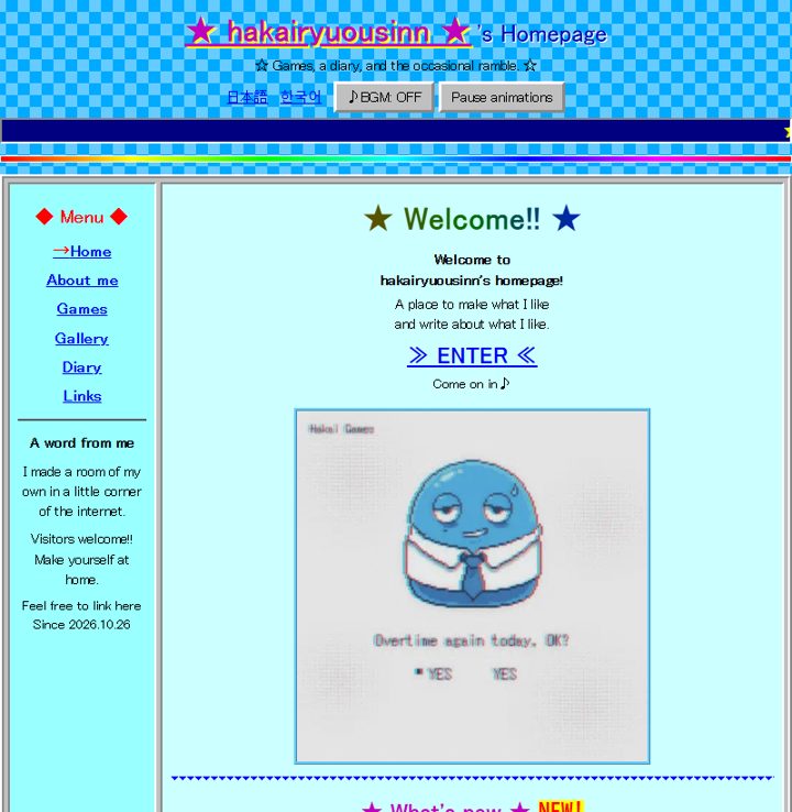
The retro look without images
The checkered background is a CSS gradient that alternates two blues every 24 pixels. The rainbow line is also a red-to-purple gradient squeezed into a thin line. No outside fonts or images get loaded, so the pages are light.
The navy banner at the top is a <marquee>, with yellow text scrolling from right to left. Modern HTML says not to use that tag, but browsers still run it fine. The buttons are gray with borders that make them look raised, like old Windows buttons.
The 3D look comes only from CSS border styles. Buttons use a raised border (outset) and switch to a sunken one (inset) only while you press them. The site name and article titles get a yellow shadow shifted 2 pixels. "NEW!" is red on yellow and blinks once a second.
The links page has a tiny 88×31 banner, plus a "link freely" note. The colors are built around light blue and blue to match my avatar.
Keeping it intact on phones
On a computer, the menu sits on the left and the content on the right. The menu is fixed at 150 pixels wide, and the content stretches to fit the screen. When the screen is 600 pixels wide or less, the menu stacks on top and the content goes below. Every time I add a page, I open it at 360 pixels wide and check that nothing scrolls sideways.
Anything that moves has a "Stop motion" button. Press it, and the scrolling text and blinking stop. If your device is set to reduce motion, nothing blinks to begin with.
There's a BGM button too. It never plays on its own. Only when you press it does a short electronic tune play.
Retro touches I removed
At first I piled on more. An "under construction" sign, a visitor counter, a note about lucky counter numbers, a note about a guestbook, a link-exchange request, and "Best viewed in IE5.0 or later."
On November 3, I removed all of it. The counter didn't show real numbers, and there was no guestbook. The IE5 note wasn't for anyone visiting today either. I was applying for an ad review, and I didn't want the site to look unfinished or decorated with things that weren't true...